A Customer Data Gathering Platform for Bank Advisors
Danske Bank 2022
Danske Bank 2022
Productive meetings between a bank and a customer requires an understanding of where the customer is coming from and what they want. This is the case for both existing and new customers. For this to happen the data quality must be high.
Before this initiative, this task was made difficult for advisors. Financial decisions require several types of data to be informed: documents, numbers, consents, etc. The bank did not have a structured way of asking for or receiving this data, meaning that each type would be send through a different platform with seemingly no template for how they should be presented. This made it a tiresome task for advisors to organize, and a difficult task for customers to understand exactly what was needed.
Fixing these issues would free up time for advisors to actually do some advising, while also giving more autonomy to customers in an enjoyable, digital experience.
Before talking about the challenges we stumbled upon, I want to talk about what we ended up building.
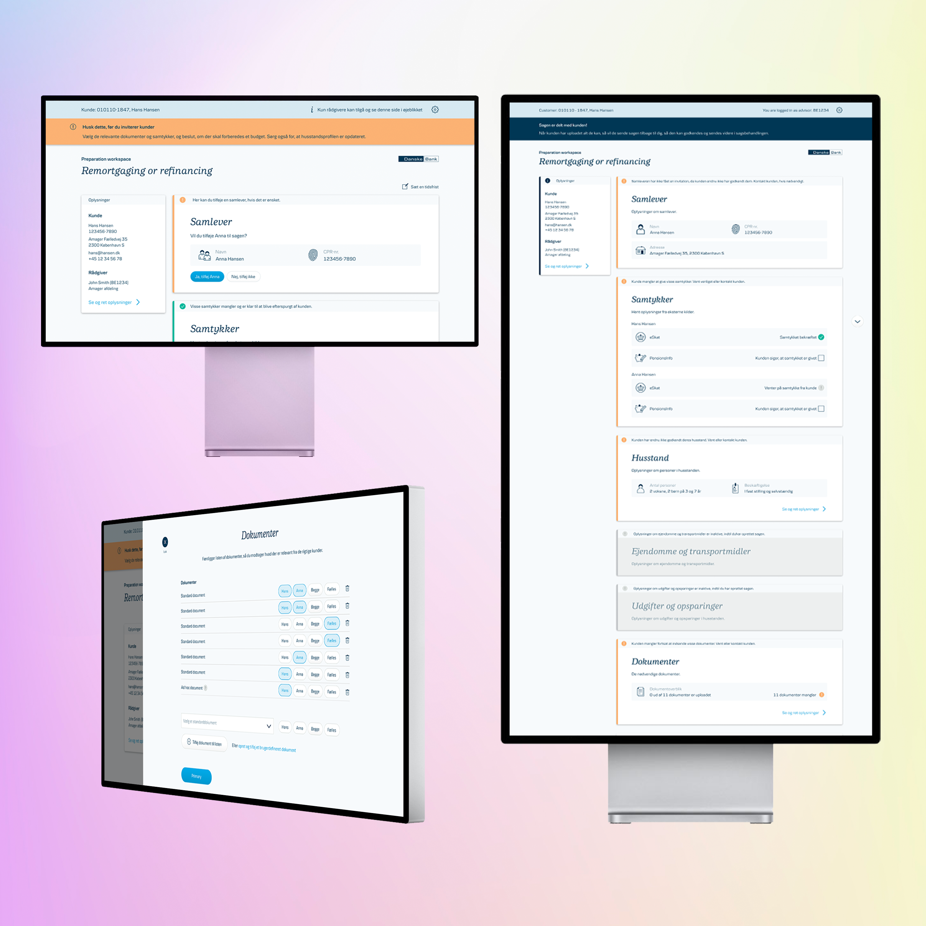
To accomplish this goal we built Forberedelsesværktøjet (Preparation Tool): a data gathering tool built for scalability, dynamicity and usability. We built separate clients for advisors and customers, so that we could cater the UI to both expert users and novice users while still keeping the layout relatively identical for guidance purposes.
The solution is built of widgets, each with a distinct purpose. Each widget is colour-coded to tell the user the task-state of the widget: what the task is, what it is for, and whether it is complete or not. Depending on who the customer is and the reason they contacted the bank, the tool and the advisor can customize the workspace to only contain relevant information and requests. From scratch we started to rebuild the advisors' data gathering in a structured way.
1
We designed and built a dynamic, pre-filling budget and combined it with the household profile. The necessary expenses in a budget and the amounts themselves change depending on the household profile of the customer. It was important that customers could relate changes in the household to changes in expenses.
2
We built a check to see if a consent already exists, and if it doesn't, it guides the customer to give the consent. This way we avoid redundant work on any user. This flow is important, as it is a requirement for the budget to be pre-filled.
3
We designed a document management solution where the requests for documents and hand-over of documents happen in the same location. This also changes depending on how many customers are on the case, and will in the future load required documents based on the type of meeting.
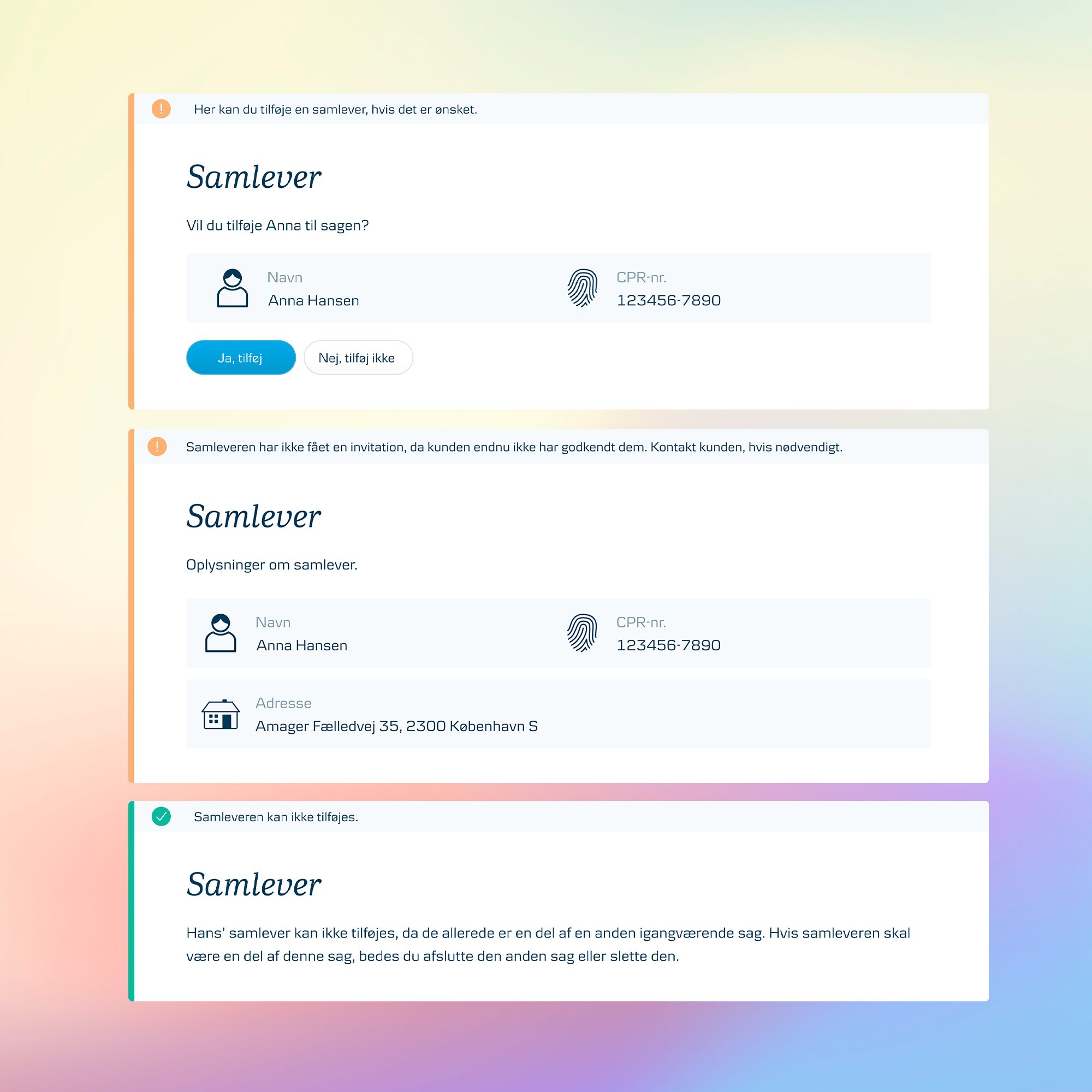
After redesigning the flow by removing the panel, the advisor can now immediately see if there is a partner to add, add that partner with one click, and get the status on them throughout the case life-cycle. All from this one widget and nothing hidden.
With that being said, such a complex solution didn't come easy, and while development was scaled back ahead of launch there are still many things that need improvement - even some things mentioned above had not been implemented when this decision ws made (prioritization was a challenge in itself).
Here is a selection of challenges from this developement.
1
Our goal from the start was to simplify the process for advisors, we kept hearing the same thing: "This requires too many clicks". While I don't know exactly what 'too many clicks' is, that is irrelevant. If it feels cumbersome then it is cumbersome. This is part of a bigger goal to simplify the entire flow, including both widgets (such as documents and budget), but also the entire life-cycle, which will be explained later.
A great example of this issue, was the functionality to add a partner on the case. This is a feature that the advisor would use in the vast majority of times, but which was hidden in a panel and in a dropdown and behind a save button: four clicks.
What we realized was, that while the only person that could be added was a registrered relation to the original customer, but this was designed to be able to add any person. I redesigned it by taking out the panel entirely, and allowing the advisor to click one button to add the partner, while having useful error handling when there was no applicable person.
2
Time for some theater of the mind. Imagine that you need to go shopping. You make the list for your partner to go shop. Once they go to the store, you want to keep tabs on what has been put in the shopping cart and what is missing.When they come home, you need to verify that what they bought was correct. All these tasks have to do with shopping, but they have wildly different purposes and therefore have different needs.
If that was too convoluted, then what I mean is, that the same is the case for the Preparation Tool. The initial goal was to create a flow that the user could go through in any order they wanted. We didn't want to lock the advisor into an order, as that would block any possible progress at all. Sadly we encountered limitations that required that certain tasks were done in a specific order and be twice-confirmed before moving on (as they could not be changed later, and would likely end in irrevocable errors), resulting in a strict playground.
This was the case for the set-up flow, which ended up being convoluted and non-sensical, by locking unnecessary parts of the 'open' workspace (a classic example of moving complexity from the product to the user). Proposed fixes for this (a simple stepper-flow to clearly distinguish from the free-flowing states and to minimize task or a technical overhaul to allow all decisions to be mutable and therefore not require a set-up flow at all) were made in close collaboration with the architect and a BA. These discussions were incredibly beneficial and revealed solutions that would not have been described without it - it was one of my favourite problems to tackle. Sadly, I didn't get to see any of them implemented and tested, but I hope it would be improved in the future