A Case Study: Making DRTV Content Discoverable
2022
2022
Danmarks Radio (DR) has a broad catalogue of digital solutions: news, radio, podcasts and TV. While DR is a public service provider, and operates under slightly different circumstances than conventional streaming services, they still share the same customer base and will inevitably be compared to Netflix, Disney+, TV2 Play, etc.
In 2022, DR restructured their organisation wanting 80% of the Danish population to interact with DR digitally. For this investment to pay off, the digital tools need some serious love. Especially DRTV (video streaming) has been heavily critisized by consumers as being unstable to the point of unusable and missing key features that the viewers have gotten used to.
I want to explore where the DRTV app fails, where it succeeds and how it can be improved. While I obviously don't have access to the same knowledge that DR has about their users' needs, nor their prioritization, I can access app reviews, competitors and my own expertise, which I will use to inform my design decisions.
While researching how DR (as a public service provider) differs from other streaming services, I noticed an interesting behavioural difference. While I can spend an entire meal (sigh) looking for something to watch on Netflix, I don't do the same on DRTV: I actually don't use it to discover content at all, I go there to watch something specific and the design doesn't really nudge me to change that.
Discoverability is the reason that a streaming service becomes a stable for people, and without it good content can sadly very easily be buried. I have identified two places where DRTV has unrealized potential to push this. As a bonus (because it was a fun exercise!), I have also outlined a number of features that do not have much to do with discoverabillity, but that modernises the app and adds some nice brownie points and innovation in the streaming space.
1
There are two reasons that a user accesses a search menu: either they can't find what they are looking for, or they don't know what they are looking for. When a user enters the search menu on Netflix, TV2 Play, Disney+, HBO Max they are immediately presented with recommendations, categories, lists and content. DRTV has a blank page.
Using this page would create more engagement for DR as a whole, encourage users to watch more, diverse content on DRTV, make it more appealing to have content on DRTV, as well as potentially saving time and headaches for the users, who cannot figure out what to watch.
The content on the page varies from product to product. Disney+ shows general categories and collection, and only specific shows after searching. TV2 Play also shows categories, but adds channels and a list of what other people have searched for. HBO Max lets the user click on search tags, and has recommendations and categories. This is really a space for DR to be creative with what to push.
2
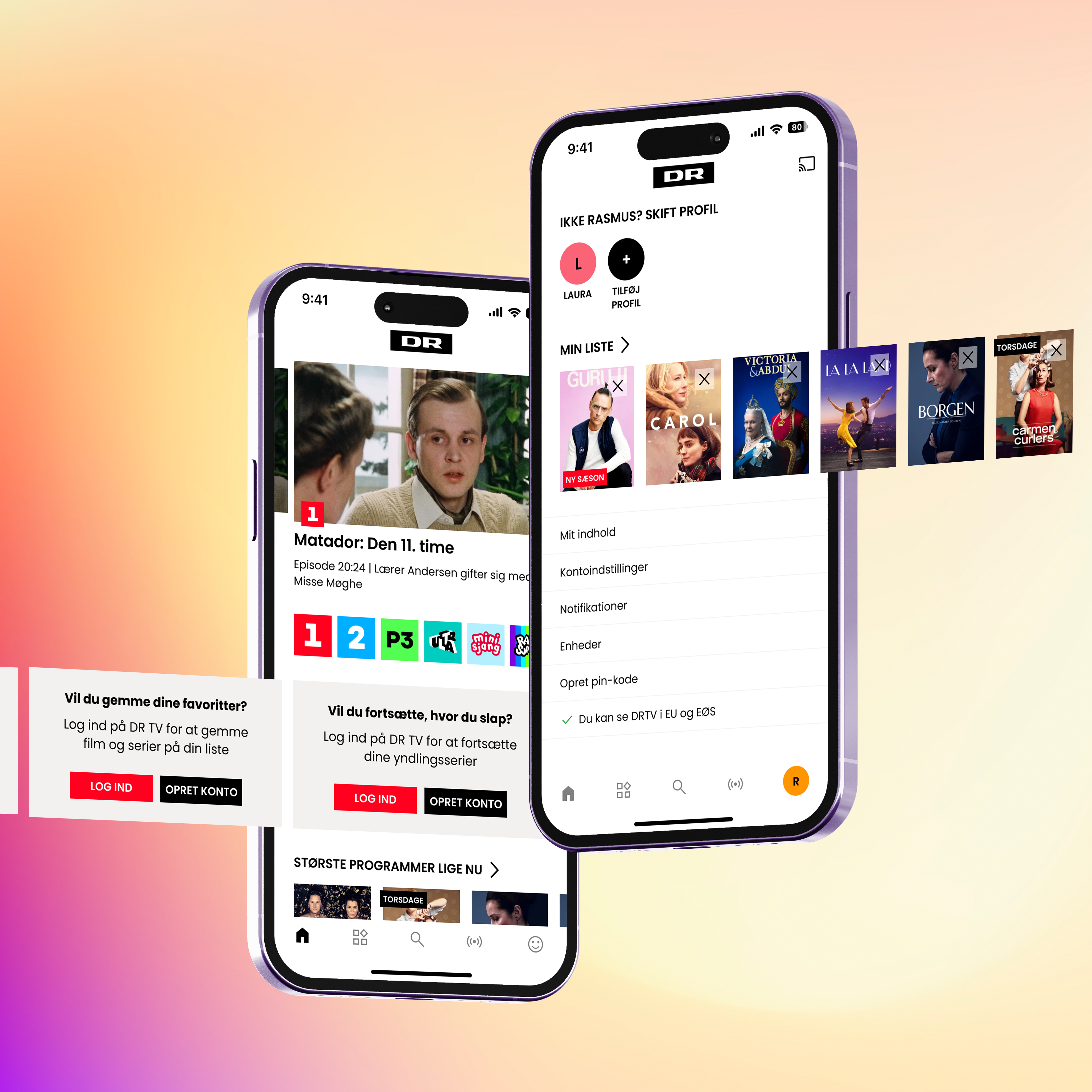
A major advantage that DRTV has over Netflix and similar services is that it is free and does not require a log-in, only a way to identify general location. It is super nice to not having to log in! However, it might do more harm than good.
Without log-in the user misses out on features that are almost intrinsically linked in streaming: "Continue Watching" (this is actually a feature that DRTV has without log-in, but it is a little unstable without a profile to attach it to), "My List", recommendations based on history. These are all features that encourage customization, create returning users, and drive discoverability. It all creates a unique experience.
DRTV doesn't encourage log-in, only having the log-in option in the burger menu and does not advertise the features provided by creating a profile. NRK, a Norwegian public service provider, is in the same situation but nudges people to create a profile using banners. The banners highlight a specific feature and gives a direct CTA to log-in or create a profile. The same should be used on DRTV, otherwise users won't even know that creating a profile is an option, let alone the advantages to doing so.
3
Certainly, the main issue with the app is stability issues making at worst the app crash, and at less worse disabling the option to ChromeCast. This is what the vast majority of bad reviews mention, and I wish I could fix it with skeleton loaders and better error messages, but I doubt it.
Fortunately, some reviews also offer ideas, tips and constructive feedback. Dark mode is a sought after feature, as the DRTV app is very bright, and lights up the entire house in the evening. It is also quite modern. Picture-in-Picture functionality was also mentioned, which I think is super interesting, as I have only seen that on Youtube and never conventional streaming platforms.
Additionally, I wanted to experiment with a new menu design that is more reachable and matches the aesthetic of DR's competitors, and a general look and feel that relies less on text and more consistent UI elements, creating a more accessible screen.
1
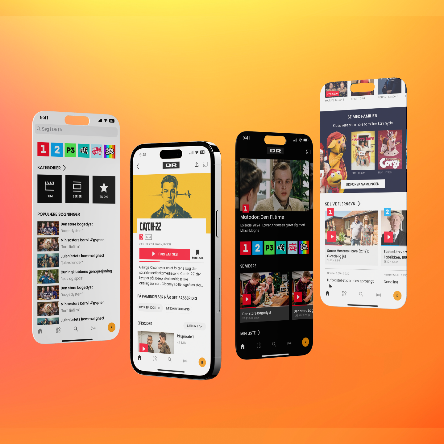
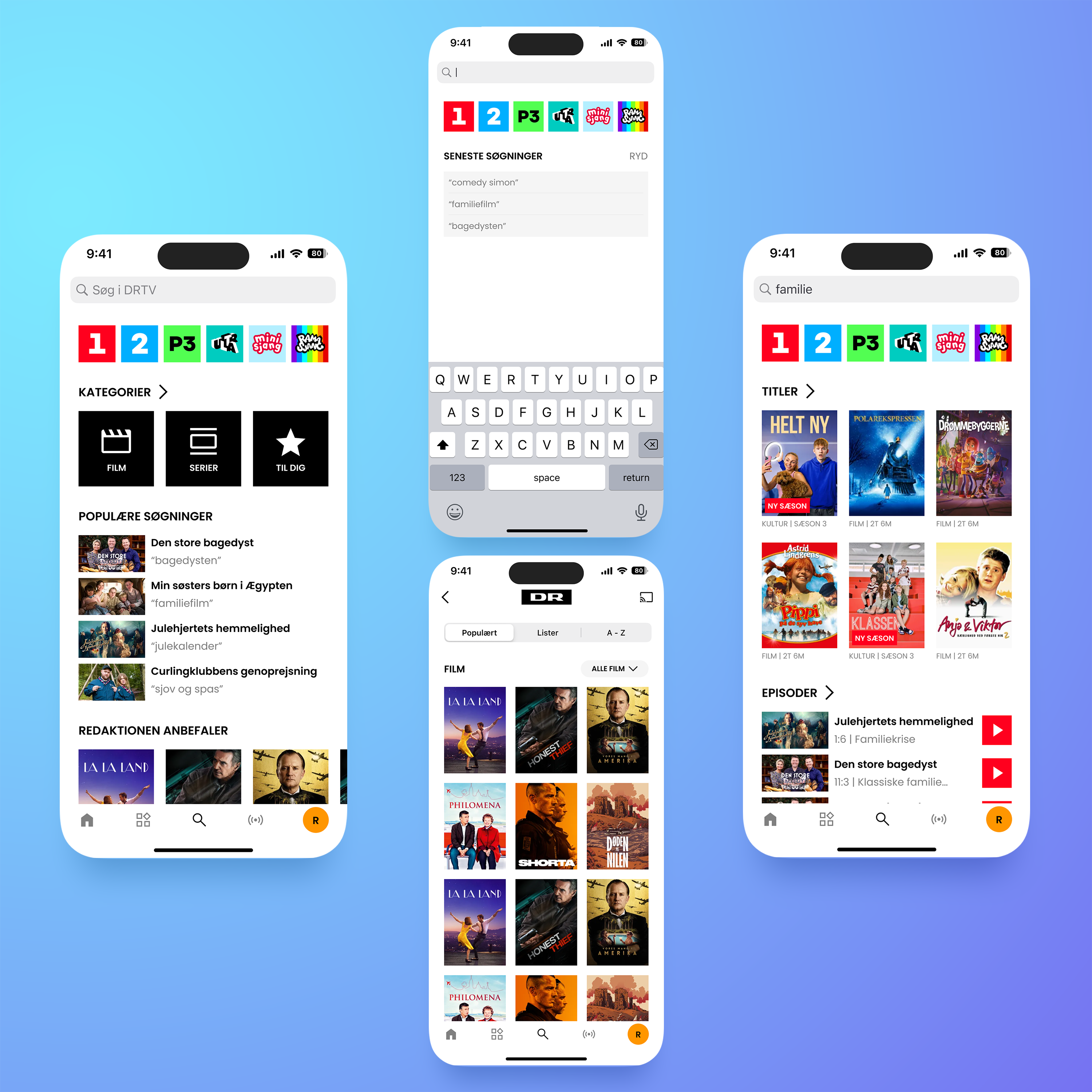
I decided to stack the search menu with content at all levels.
DR first splits there catalog between their channels, so let's present that first. It allows the user to quickly look for content for a specific viewer type. Secondly but similarly, I have placed a selection of generic categories, as well as a link to the rest of the categories.
I also added a section for popular searches, but wanted it to show both what people searched for and what they ended up clicking on (this might be a programmer's nightmare), which I think is a pretty unique way to encourage people to click on content that they probably wouldn't otherwise have.
When actively searching, the user gets to see their previous searches, and when complete they see content split into titles (movies and series) and specific episodes. It makes it easy to find anything you might be looking for. Lastly, when inside a category, the user can filter the content further into popular titles, curated lists or alphabetical order.
Now it should be possible for even me to find a movie before my meal gets cold!
2
To nudge people to log in, I blatantly stole NRK's idea and created banners that highlight the benefits of having a profile. Nothing less and nothing more. The big issue as I saw it, was that no where on the main page was there a log-in button, and nowhere was there a reason to do so. Now there are both.
If this works, I would also encourage more personalised lists: both to speak to peoples' interests but also to highlight things that they might not have looked for. Personalisation is the tool to direct discoverability and creates order in the madness of recommending content.
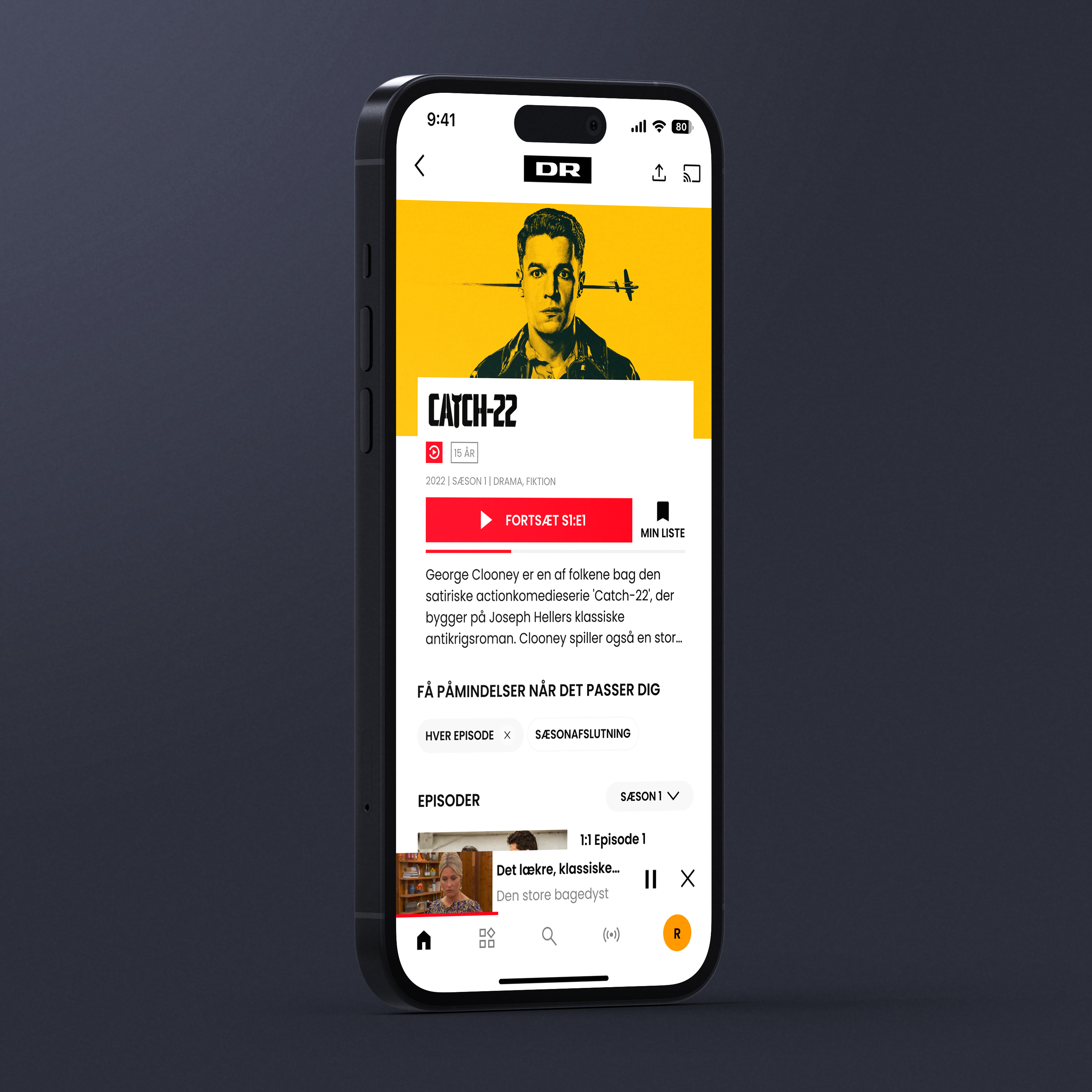
Something new that I haven't seen before, but I wanted to explore, was notifications fitting the user's viewing patterns. Since DR is (probably) indifferent to how their users watch their shows, I would like to let the user decide. With the click of a button, the user can decide if they want to get notifications when a new episode of their show comes out or when the season has ended. DRTV gets to pull their users back, and the users gets to decide when: it's a win-win. The user can access all their set notifications in their profile.
3
And now for some fun experimentation!
A beatiful dark mode adds a whole new and fresh dimension to DRTV and would fit any platform it exists on. Let the user decide which mode they want, or as a fun experiment, change the mode automatically based on sunrise and sunset times!
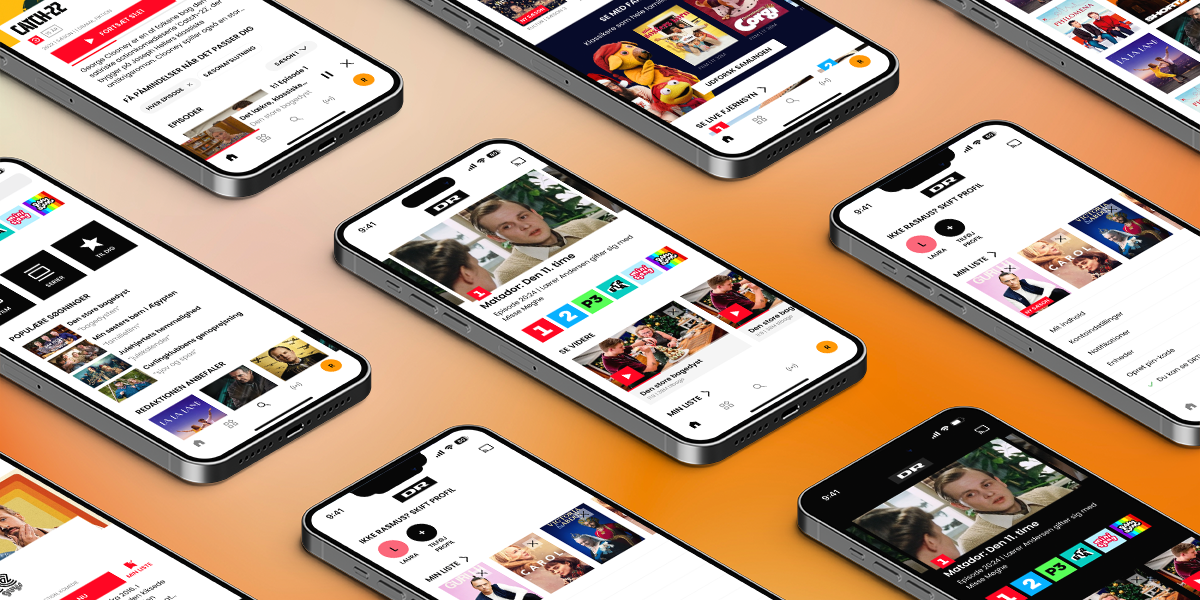
I have also designed a new menu that is more reachable and with a simpler layout based on icons. The tabs are more distinct and makes more sense (in my opinion), as I have removed "Tekst-tv" and "Børn" and "Ultra" and placed them inside "Live" and "Categories", respectively.
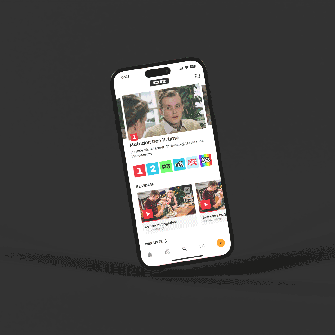
On the series page, I have placed the new notifications settings. I considered having an option for "No notifications", or one button that switches between the states when clicked, but decided on a simpler interaction. Users can now also look at this page while still watching another show with the Picture-In-Picture functionality!
This was a very fun case study to work on, as it addresses issues I have had with DRTV myself. I think DR and DRTV are priceless and an incredible gift to the citizens of Denmark, so trying to recreate screens in Figma and creating improvements that I actually find quite valuable, was a real treat.
This case study was made without request or support from DR. All movies and series are the property of their respective owners. I own none of it.