A Refreshed UI for Event / Ticketing Platform
Ticketbutler 2021
While the idiom "form follows function" rings true to me, I do find it critical to not forget to make products beautiful. I find it to be an important but often forgotten part of inclusivity: why should differently abled people be made to think that products made for their needs has to forgo being beautiful?
When I worked at Ticketbutler, they already had an established brand, functional product, and dependent customers, but they wanted to update their visual identity to be more modern. I was taken in for a month to, among other things, identify where to most effectively use their resources and find easy pickings for UI improvements and make designs with a wow-factor.
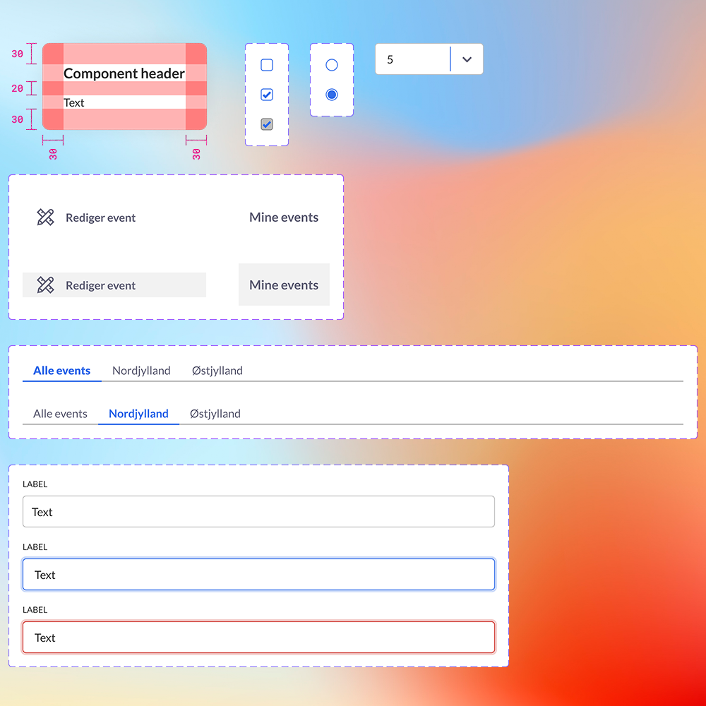
To maintain consistency I wanted to create a simple, barebones design system. I used Figma's variant system (halleluja!) to document states for the developers. This is the section on the componenents that had issues.
During my initial discovery phase, I structurally went through every page of the Ticketbutler client and documented each issue as I found it. I did not think in solutions at this point, but I needed to know all this in order to understand where I could make the biggest impact.Additionally, I also documented each functionality and information category that I encountered to create an information architecture mapping, as I wanted to investigate the overall structure of the product.
I found many issues, big and small, that I wanted to tackle.
1
In my research I found that the client had confusing information hierarchy and architecture, which made it difficult to intuitively understand where to find desired functionality. An example I found was that the menu "Ticket settings and discounts" consisted of general settings about ticket amounts, refunding, discount codes, etc., but to add and remove tickets you need to go to the "Edit event" page.
2
The tool presents a lot of customization options for the user in order to create the exact setup for the event they are hosting. The user will interact with inputs a lot to do this. Ticketbutler lacked consistency in this regard, using different styles of the same input types (button states, dropdowns, text fields, etc.) throughout the user journey. This adds complexity to the users learning how to use the tool.
2
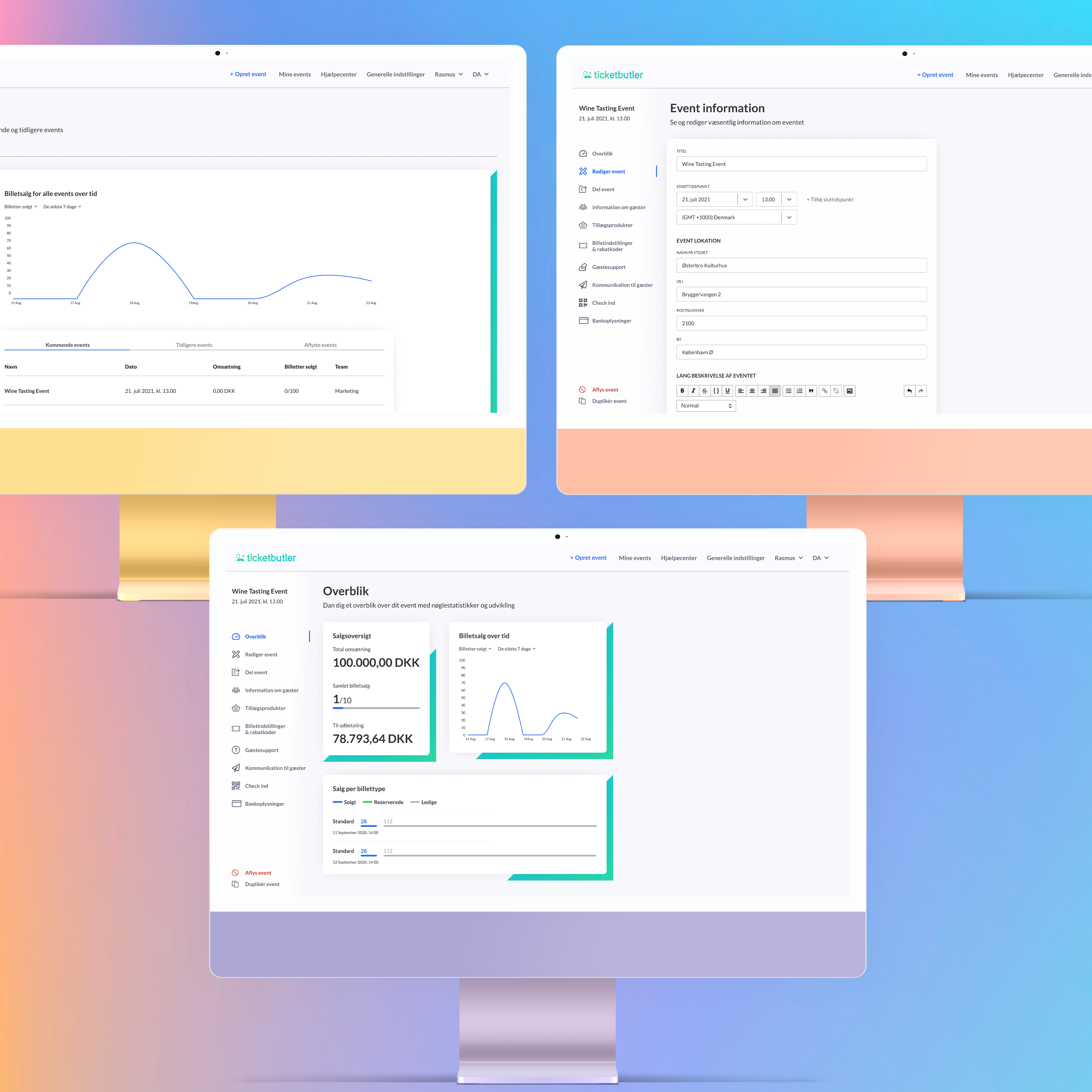
The main reason I was hired, was to modernise the look and feel of the site. It had a very practical feel, where things were styled only passably to function. It looked dated. This affects the perceived usability negatively. I needed to find ways to create a fresh look without requiring too many resources.
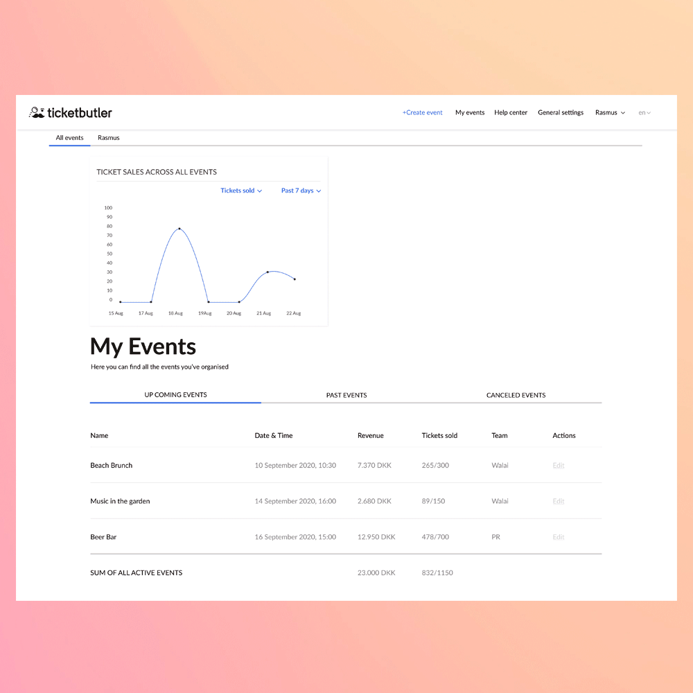
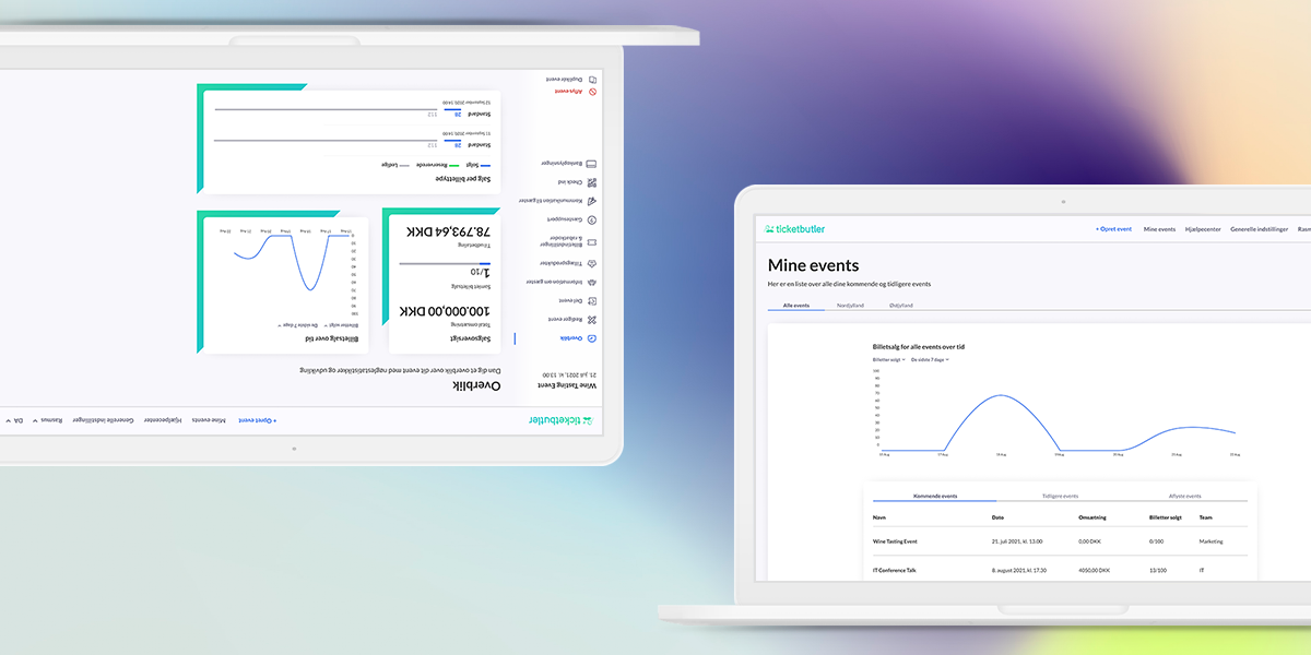
The "My Events" page before and after adding the new look and feel. Notice the improved hierarchy, the softness and the colours.
What were the new look and usability improvements?
1
I wanted to tackle the information hierarchy in two ways. First, for cheap, I decided to re-design the sidemenu to be more visually pleasing, and get some serious usability points for free. The menu consists of many items, and I wanted to make it easier to distinguish them from eachother with icons and colour. I found multiple appropriate icons for each menu and ran them by the team to select the ones we associated most with the content. Additionally, I really wanted to make the "Cancel event" button stand out, by colouring it red instead of the default menu font colour. This was also consistent with what Ticketbutler's competitors were doing.
As a more long-term and resource-heavy solution I wanted to rehaul the entire information hierarchy, creating new menu items and menu tabs. My goal was to follow a more logical and intuitive grouping, and while I didn't do any card sorting with users, I could pretty easily map it to my own mental model. This has sadly not been implemented yet.
2
Now, how to make something look modern? I did the groundbreaking thing and looked at inspiration. I looked at many different kinds of dashboards to see what the trends were and how they could be applied to Ticketbutler. We decided that we didn't have to go away from using cards - this way of separation has been trendy for a while and will likely persist for a while too - but to style them differently. Using sharp corners (I do see the irony) and hard shadows made it look old, so I softened the shadows with high blur and a lighter colour, as well as rounding the corners, making the whole thing look a lot friendlier. I also went away from the completely black font, for something a little softer.
We also added a little brand colour into the mix, with the added triangles that hugs the corners of the cards. This is purely aesthetic, but it adds some edge to the site and breaks things up a little. Mostly, it looks cool.
I also really wanted to implement dark mode (what is more modern than that?!). It would also make it a lot easier for customers to fit the ticketing box onto their own sites. I made a design which has not been implemented yet.
In general both Ticketbutler and their customers have been delighted with the changes implemented, saying that it is "pissepænt" and "a feast for the eyes". I would have liked to do the same work on their ticketing box to have the same pleasing UI shown for the organizers' customers as well.